Client
Vancouver Black Library
Timeline
Jan 2023 - Apr 2024
Team
Michelle Chen
Billie Hu
Alannah Berson
Alyssandra Maglanque
My Role
Card Sorting
Surveys
Prototyping
Literature Review
Heuristic Evaluation
Usability Testing
Tools
Figma
Miro
Balsamiq
Optimal Workshop
Qualtrics
At a Glance…
🏛 What is Vancouver Black Library(VBL)?
The Vancouver Black Library (VBL) is a community-led organization that fosters connection and belonging within Vancouver’s Black community. Inspired by the historic Hogan’s Alley, it provides a space for education, engagement, and the preservation of Black histories, supporting the community through resources and programs.
Overview
The Vancouver Black Library (VBL) is a community-focused organization that needed to transition from scattered digital resources on Instagram and Google Drive to a centralized website. My role evolved through two phases:
This process combined collaborative efforts and rigorous individual research to deliver a user-focused solution for VBL’s digital presence.
🌗 Phase 1:Team-led effort combining primary and secondary research to define the website's information architecture, develop a mid-fidelity prototype, and document design recommendations to guide VBL's desired website appearance and functionality
🌕 Phase 2: Independently evaluated the prototype using heuristic analysis, usability testing, and systematic literature reviews, providing evidence-based recommendations.
Impact and Results
A website prototype with intuitive navigation menu that supports both patrons and VBL volunteers
The Usability Study
The usability study evaluated the VBL website prototype through task-based testing with 8 participants. Participants completed three core tasks—navigating the catalog, accessing the volunteer form, and RSVPing for events—while thinking aloud. I combined quantitative methods (e.g., task success rates, and completion times) with qualitative insights (e.g., user feedback, and pain points) to identify usability issues and refine the design. The study ensured the prototype aligned with user needs and expectations.
Highlighted recommendations are as follows:
Enhance book navigation on the VBL website
Users struggled with the 'discover books read here' bar and unclear menu terminology, making navigation improvements essential.
1
Improve the accessibility to volunteering informationand portal
Volunteers are key users, but suggestions included redesigning the volunteer form and clarifying the log-in button's purpose.
2
Enhance VBL events features
Participants found the RSVP process clear but were confused by the menu's separation of VBL and local events. Suggestions included adding features to improve the event experience.
3
Increase the abundance of homepage content
The homepage, while functional, serves as the website's backbone but could benefit from enhanced content, as revealed through usability testing.
4
PROJECT PHASE
Let’s unravel the journey of crafting VBL’s website experience…
🚩 Start with phase 1
DESIGN PROCESS
Understand the Problem
⭐️ The Problem
In our kick-off meeting with the Vancouver Black Library (VBL) team, we learned that their digital presence was fragmented and underdeveloped. The organization relied on Instagram, Linktree, and scattered Google Drive documents to share information, which led to inefficiencies and made it difficult for users to find resources. These challenges highlighted the need for a centralized, user-friendly platform to streamline access and better engage the community. Key pain points included:
Fragmented Information: Volunteer materials, event details, and the library catalog were spread across multiple platforms, leading to disorganization and difficulty in locating essential resources.
#1
Lack of Online Functionality: Without a dedicated website, VBL lacked features like an event calendar, RSVP tools, and a volunteer area, which are crucial for effective community engagement and support.
#2
Limited Scalability: The current system was time-consuming to manage and incapable of growing alongside VBL’s increasing needs and goals.
#3
Audience Accessibility: Dependence on Instagram excluded users unfamiliar with social media, while poor navigation and scattered resources further discouraged broader community participation.
#4
These challenges highlighted the need for a centralized, user-friendly platform to streamline access and better engage the community.
📝 Research Plan
We developed a research plan, including surveys, card sorting, and secondary research, to redesign VBL's website into a user-centered, scalable platform that reflects its values and supports its community.
Primary Research
1.Survey
We conducted an online survey using Qualtrics, distributed via VBL's Instagram account to maximize reach.
With 15 valid responses, the survey revealed a heavy reliance on Instagram for event updates and highlighted the need for improved resource organization.
2. Card Sorting
We conducted card sorting, both in person at VBL and online via Optimal Workshop with 9 participants.
The activity revealed intuitive groupings like "Library Resources," "Events," and "Volunteer Opportunities," providing a clear structure for the website’s navigation.
Secondary Research
1.Literature Review
We explored best practices in website navigation and information architecture, focusing on libraries and non-profits. Studies highlighted key factors influencing user satisfaction, such as credible content, logical structure, and accessible design.
2. Contextual Research
We reviewed VBL’s historical and organizational documents, including the "BHM Media Campaign Masterdoc," which provided valuable insights into Hogan’s Alley’s legacy and VBL’s mission. This ensured the website reflects VBL’s cultural significance while meeting modern usability standards.
3. Benchmarking
We drew inspiration from community-focused websites:
Out on the Shelves: A volunteer-run library with a simple, user-centric design and clear catalog navigation.
Out in the Dirt: A seed library featuring organized tabs, event sign-ups, and volunteer tools, aligning with VBL’s needs.
Quantitive Data
The online survey provided critical insights into how users interact with VBL and their expectations for a new website. Key findings included:
Survey Analysis
67%
of respondents were aged 18–34, reflecting VBL’s strong social media presence and younger audience.
80%
discovered VBL through Instagram, making it crucial to integrate Instagram content into the website design.
20%
relied on physical visits or word of mouth, indicating room to expand offline engagement.
15%
faced difficulties navigating the library catalog, while most were comfortable using laptops or smartphones to access information, highlighting the need for more user-friendly tools.
Qualititve Data
The qualitative data analysis highlighted both the strengths and challenges of VBL’s current digital presence, providing clear direction for the website redesign. Users expressed a strong desire for intuitive navigation, centralized resources, and engaging features that align with VBL’s mission.
Below is the affinity diagram categorized by themes:
We grouped survey responses into themes on user preferences, liked features of past library websites, challenges with VBL's TinyCat Catalog, and barriers to borrowing books.
Card Sorting Result
Card sorting, analyzed with a similarity matrix and dendrogram, revealed how users group content, offering insights into VBL's website structure and challenges.
Data Analysis
Similarity Matrix Analysis • Core Categories
The similarity matrix provided a clear view of how participants grouped website content, revealing strong patterns that informed the website’s information architecture
Community Resources: “Job Opportunities,” “Grant Opportunities,” and “Black Business Directory” were consistently grouped, highlighting a need for a section focused on community support.
Organizational Information: “Connect with Us,” “Why VBL ~ A History Lesson,” “What is VBL,” and “Staff Directory” formed a group, indicating the need for a section introducing VBL
Library Resources: “Digital Collections,” “Popular Genres,” “Guidelines for Borrowing,” and “About Our Catalogue” were grouped together, suggesting a unified library section.
Dendrogram that Used the Best Merge Method (BMM) • User Challenges
The dendrogram shows how participants grouped website content, highlighting agreement patterns and variation areas. It identifies consistent groupings for core categories and reveals where user perceptions diverge.
Strong Agreement on Core Categories: The dendrogram reinforces categories identified in the similarity matrix, with “Job Opportunities,” “Grant Opportunities,” and “Black Business Directory” grouped under Community Resources, and “Digital Collections,” “Popular Genres,” and related items under Library Resources.
Areas of Variation: The inconsistent grouping of “Volunteer Resources” and “Clubs” suggests unclear labels that need refinement.
Potential Overlap: The grouping of “Events” with “Community Engagement” indicates the need for clearer distinctions between these categories.
The dendrogram confirms patterns from the similarity matrix while highlighting areas where improved labels and clearer boundaries are needed for enhanced navigation.
DESIGN PROCESS
Sharpen the Focus
Persona Development
We developed the website's IA using data from card sorting exercises, a similarity matrix, and a dendrogram.
Denise represents a busy school teacher who engages with VBL online due to infrequent physical visits.
Occupation: Elementary school teacher.
Demographics: Mid-30s, lives in Vancouver, identifies as BIPOC.
Engagement with VBL: Visits the library infrequently but keeps up online and attends events when possible.
Goals: Connect with the community, find meaningful volunteer opportunities, and access curated resources.
Pain Points: Struggles with TinyCat and locating centralized, easy-to-navigate information
💡
Empathy Mapping
We mapped Denise’s thoughts, feelings, and behaviors to deepen our understanding of her experience:
Think & Feel: “I want to contribute to the Black community but don’t know where to start.”
Hear: Positive stories about VBL but confusion about accessing its services.
Say & Do: Follows VBL on Instagram and occasionally attends events but struggles to find detailed information.
Pain Points: Difficulty finding cohesive resources; limited digital literacy tools.
💡
As-Is Journey Map
We also documented Denise’s current journey with VBL to uncover pain points and improvement opportunities
Discovery: Finds VBL via Instagram but struggles to locate more detailed resources.
Engagement: Limited interaction due to fragmented and scattered resources.
Action: Visits the library but encounters challenges navigating digital tools like TinyCat.
💡
The research and analysis guided the development of a user-centered IA, ensuring that the VBL website addresses key user needs. By integrating findings from the persona, empathy map, and journey map, we created a roadmap for a cohesive, accessible, and community-driven digital platform.
DESIGN PROCESS
Explore Possibilities
Core Design Requirements
Building on insights from the previous stage, the VBL website design prioritizes user accessibility, clear navigation, and community engagement, with key requirements including:
Intuitive Site Navigation
Simplify access to resources with clearly defined categories.
01
Digital Engagement Tools
Incorporate tools like event RSVPs, curated book collections, and volunteer forms, while translating the physical Community Bulletin Board into a digital format to share resources with users who cannot visit in person.
02
Ideating Digital Engagement Tools for the VBL Website
Two main areas of focus were digitizing the Community Bulletin Board's content and designing navigation pathways for external links that guide users to resources beyond the VBL website.
Community Bulletin Board
The physical bulletin board is a crucial resource at VBL, especially for sharing events and opportunities. Our goal was to translate this into a dynamic digital format that maintains its value for users who cannot visit in person.
The Solution: Events Carousel
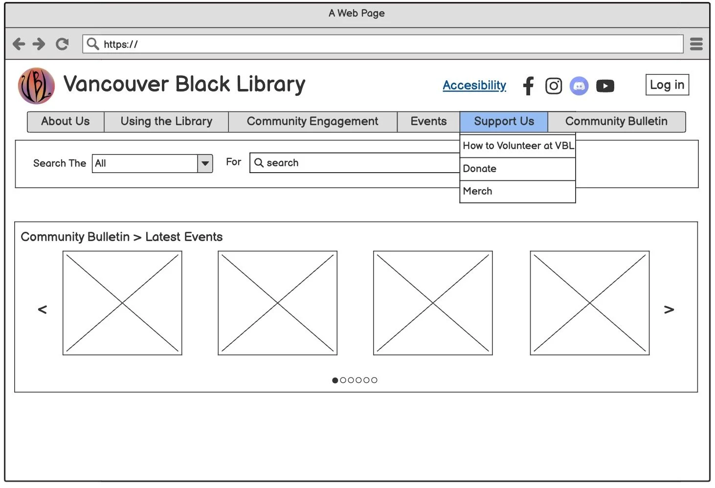
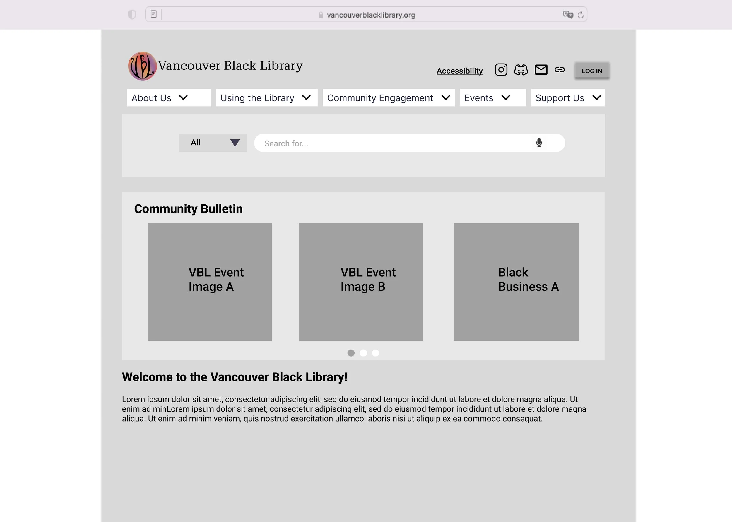
We designed the Events Carousel to display visually uniform tiles that link to detailed pages within the website for more information.
Design Reference: Inspired by the SFU Library’s carousel, each tile features concise text and a clickable link, directing users to pages with full event details or resource descriptions.
Key Features: Highlighted events and resources on the homepage for easy visibility.
Design Considerations
Ease of Updates:
The carousel should allow simple updates to images and links, enabling VBL staff to maintain relevant and current content.
Comprehensive Support:
Events not featured on the carousel are accessible via a dedicated Events Page, organized by date, type, and host for a full overview.
External Links Navigation
Since some actions require users to interact with external platforms, such as TinyCat or volunteer intake forms, we designed pathways to guide them effectively while keeping the experience intuitive.
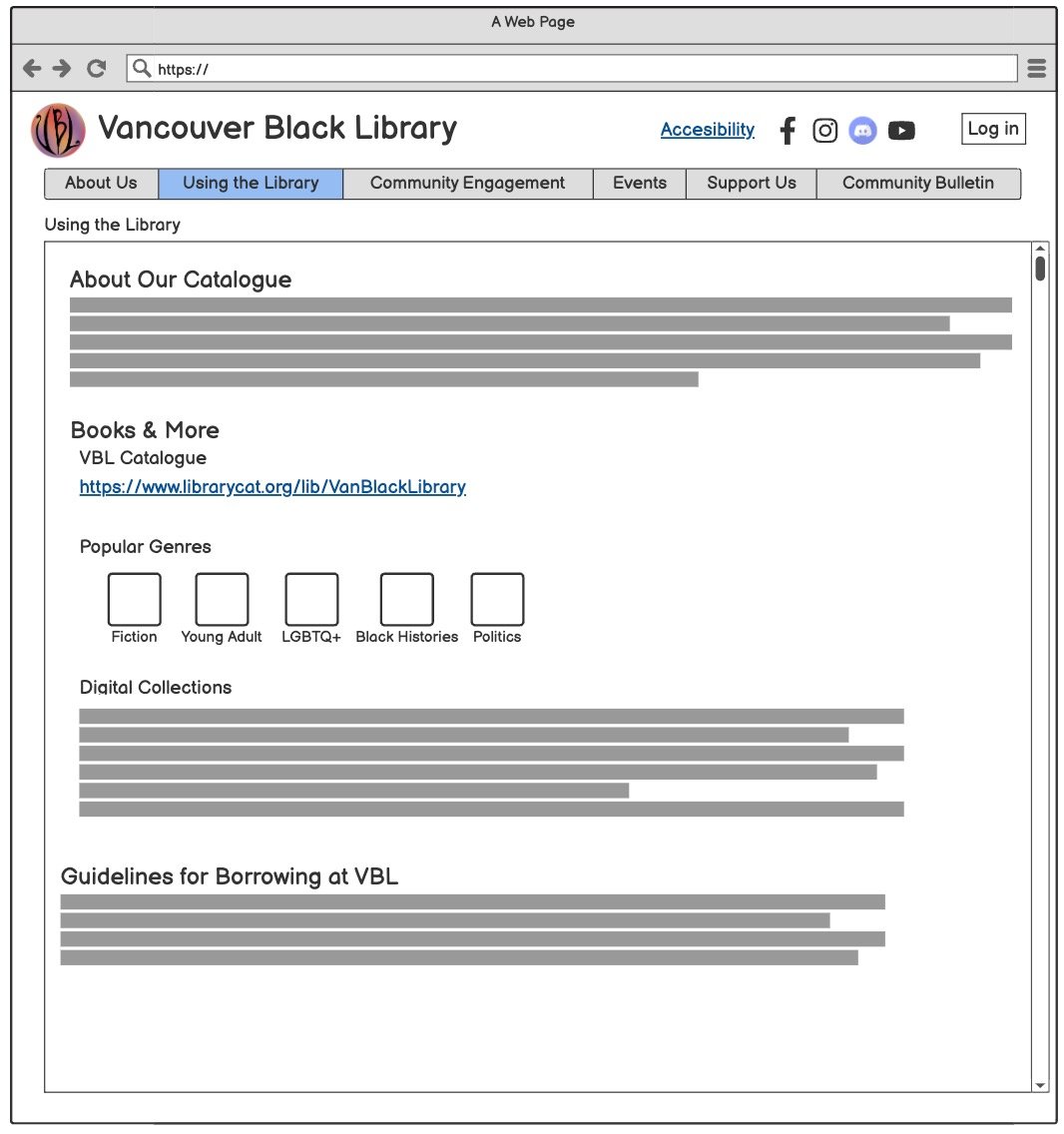
Book Collections: Users can access an external link to the TinyCat online catalog. This design decision was made in consultation with the VBL team, considering the current limitations of integrating TinyCat directly into the website. The link ensures users can still navigate the catalog seamlessly while keeping the website’s development aligned with its current phase.
Volunteer Intake Form: In the Support Us section, an external link provides quick, user-friendly access to the volunteer intake form. This design, aligned with VBL's preference for consistency, ensures a direct and simple solution for accessing volunteering opportunities.
Design Considerations:
Clear Labels:
External links, such as those for the TinyCat catalog or volunteer forms, are clearly labeled to set expectations for users.
Consistent Navigation:
Links are placed within logical categories (e.g., TinyCat under "Using the Library" and volunteer forms under "Support Us") to reduce cognitive load.
User-Focused Design:
External links open in a new tab, preserving the user’s session on the VBL website for uninterrupted navigation.
User Tasks
Three key tasks were created to address challenges identified through survey data, such as difficulty navigating the catalog, finding volunteer resources, and registering for events.
Select a Book from VBL’s ‘Black Histories’ Collection: Simplifies browsing the VBL catalog to locate a book from the "Black Histories" collection, addressing users’ struggles with TinyCat navigation.
Find the VBL Volunteer Intake Form: Streamlines access to the Volunteer Intake Form, solving issues with scattered and unclear resources.
Event RSVP: Provides an intuitive process for registering for a community event, overcoming the lack of clear RSVP tools.
These tasks directly respond to user pain points, ensuring a more seamless and user-friendly experience.
DESIGN PROCESS
Bring Ideas to Life
Developing the Information Architecture (IA)
Using data from card sorting exercises, a similarity matrix, and a dendrogram, we developed the website’s IA.
Low-Fidelity Prototype
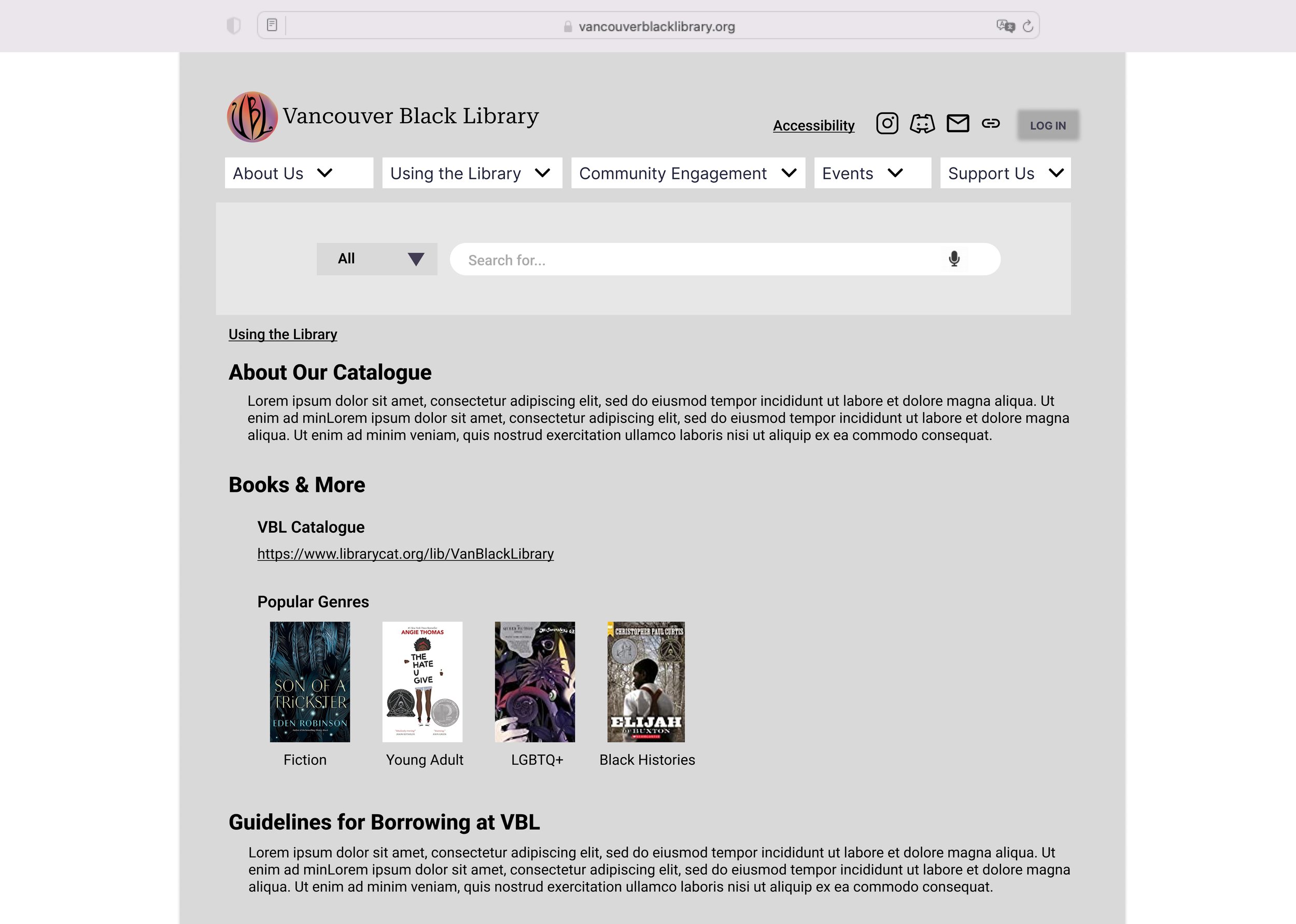
We created a low-fidelity prototype using Balsamiq. This initial design was informed by VBL’s goals, user survey insights, and card sorting results. It focused on establishing the basic layout and functionality, allowing us to test key ideas like navigation structure, clickable genre links, and a digital version of VBL’s community bulletin board. This prototype served as the foundation for gathering feedback and refining the design.
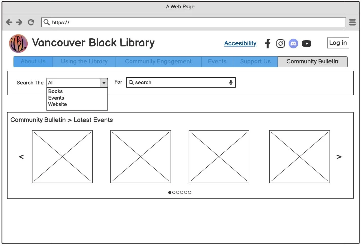
Homepage & Community Bulletin Board
Book Collections
Volunteer Forms
About Us
DESIGN PROCESS
Test and Refine
User Testing • Formative Evaluation
To ensure the website met VBL’s goals and user expectations, we conducted a formative evaluation with one of VBL’s main organizers. This session focused on testing the low-fidelity prototype and refining our design based on feedback.
During a 15-20 minute session, we showcased the main design features, including clickable genre links, a digital version of the physical bulletin board, and initial navigation options.
What Worked Well
Event Carousel: Highlighting upcoming events on the homepage resonated with VBL’s mission to increase engagement and draw more visitors.
Clickable Genre Links: The VBL team valued this addition, inspired by user survey feedback. While not a primary design focus, our team implemented genre links for quick access to Tinycat categories, eliminating the need for users to search manually.
What We Refined
Content Prioritization: Information about donations was moved to the top of its page for better visibility.
Before
After Refinement
Bulletin Board vs. Community Engagement: The “Community Bulletin” tab was confusing alongside the “Community Engagement” menu. Based on feedback, we integrated stable resources (like directories and organization links) into the Community Engagement tab and removed the bulletin tab.
The Community Engagement section became the central hub for long-term resources like directories and collaborative opportunities.
The Event Carousel on the homepage was retained as the space for highlighting dynamic, time-sensitive announcements such as upcoming events.
Before
After Refinement
Medium-Fidelity Prototype
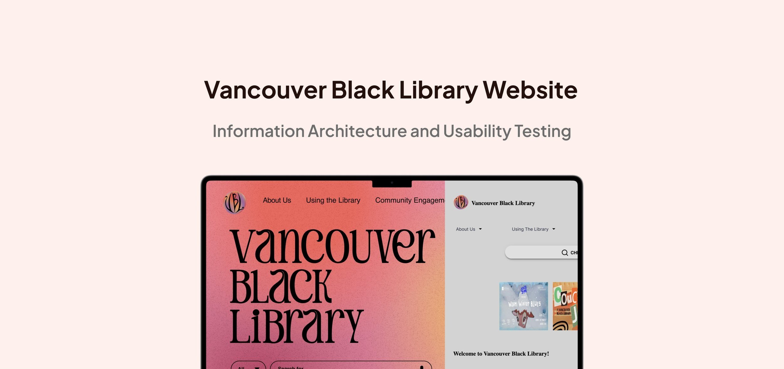
The mid-fidelity prototype showcases the refined design of the VBL website, incorporating feedback from user research and organizer input. Key features include streamlined navigation, an event carousel, external links for resources like TinyCat and volunteer forms, and an organized Community Engagement section.
User Task Storyboard
The mid-fidelity prototype demonstrates how the website design supports three essential tasks for VBL users and volunteers: browsing the catalog, accessing the volunteer intake form, and RSVPing for events. It showcases how the proposed features and navigation enable users to efficiently complete these tasks, addressing their needs and challenges identified in the research.
1. Select a book from VBL’s ‘Black Histories’ Collection: Navigating the TinyCat system to locate books easily.
2. Find the VBL Volunteer Intake Form: Easily Accessing the Volunteer Intake Form.
3.RSVP for the event : Easily Finding and RSVPing for Community Events.
PROJECT PHASE
The content for Phase 2 is still in progress👩💻, but you can access the detailed usability study report to explore the findings and insights.
Takeaways and Reflections
Research-Driven Design
Learned the value of integrating qualitative and quantitative data, such as survey results, card sorting, and usability studies, to create user-centered information architecture and usability improvements.
1
Adapting to Resource Constraints
Addressed challenges like the limited ability to fully integrate TinyCat and the absence of an existing VBL website, which required creative solutions such as external links and simple navigation structures.
2
Collaboration with Stakeholders
Collaborated effectively with the VBL team to align the website’s design with their vision, incorporating feedback from organizers and users to refine features like the Events Carousel and Community Resources page.
3
Mastering Heuristic Evaluation and Usability Testing
Gained hands-on experience in conducting heuristic evaluations and usability testing to identify usability issues and pain points. This allowed me to make actionable recommendations for improving navigation, accessibility, and overall user experience.
4
🤔 Reflections
This project enhanced my skills in user-centered design, heuristic evaluation, and usability testing, teaching me to identify challenges and deliver actionable recommendations. Working within resource constraints, like limited TinyCat integration, emphasized the importance of creative problem-solving and phased solutions.
Collaborating with the VBL team reinforced the value of stakeholder engagement and iterative design, while building foundational structures like information architecture and navigation balanced creativity with practicality. This experience strengthened my ability to design scalable, user-focused solutions.
